


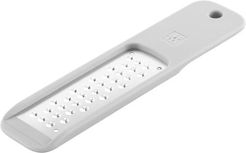
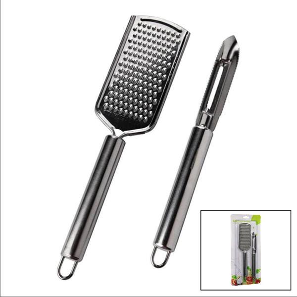
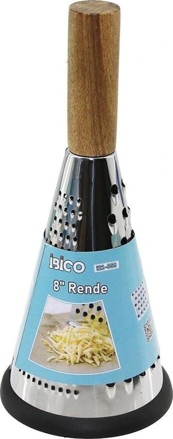
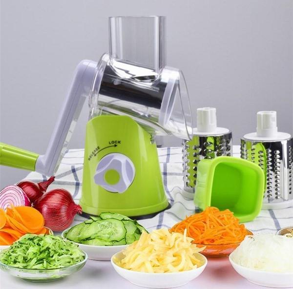
Benzer Ürünler


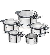
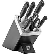
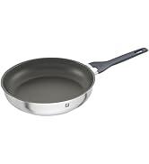
Zwilling
Bıçak, tencere, tava, çatal bıçak takımı ve mutfak aletleri - Mutfağınız için Zwilling dünyamızın çeşitliliğini keşfedin.
-

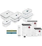
![[Amazon'a özel] Zwilling Fresh & Save vakumlu başlangıç seti, cam, 11 parça, La Mer](https://images.idefix.com/mpstatics/product-description/215f5d2dc4240e30eacf119230cfa7ce-68ee29029c33d.jpg)
Öne çıkan özelliklerimiz:
-

ZWILLING - 290 yıldan uzun süredir
Zwilling, 1731 yılından beri dünyaca ünlü bıçak, bıçak ve makas üreticisinin memleketi Solingen'de bıçak ve mutfak ürünleri geliştirmektedir. Zwilling dünyaca tanınan bir markadır ve insanlara yemek pişirme tutkusu ile ilham verir. Uzun gelenek ve sürekli büyüyen ürün yelpazesi sayesinde sizi her zaman yeniden heyecanlandırmak için bilgi birikimine sahibiz.
-
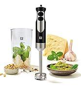
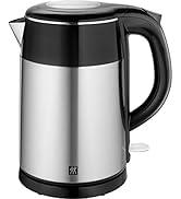
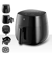
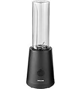
ZWILLING Mutfak Aletleri
-
Neden idefix?

Siparişinizi teslim aldığınız tarihten itibaren 14 gün içinde iade edebilir, iade sürecinin tamamlanmasının ardındansa ödemenizi hızla geri alabilirsiniz.

Kullanıcı dostu ara yüzümüz tüm ihtiyaçlarınıza eksiksiz yanıt verebilmek için tasarlandı. Deneyiminizi uçtan uca kusursuz kılmak adına çağrı merkezimiz ve canlı destek hattımızla ihtiyaç duyduğunuz her anda yanınızdayız!

Siparişlerinizin bir an önce ulaşması için sabırsızlandığınızın farkındayız. Sunduğumuz farklı teslimat seçenekleri arasından size en uygununu belirlemeniz, siparişinizi olabildiğince çabuk veya dilediğiniz zaman aralığında sorunsuz bir biçimde teslim etmemiz için yeterli.