




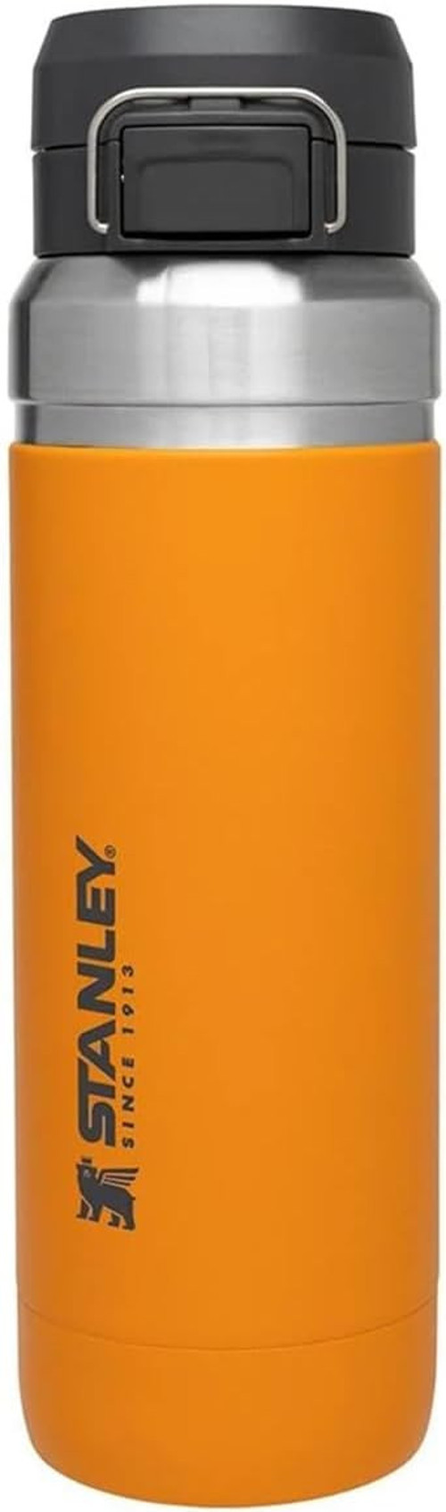


Özellikler ve Spesifikasyonlar: Şişe Tipi: İçecek şişesi, Özellikleri: Çift Duvar, Yeniden Kullanılabilirlik: Yeniden Kullanılabilir, Konteyner Türü: Şişe, Spor Türü: Spor. Materyal ve Bakım: Malzeme: Alaşım Çelik, Ürün Bakım Talimatları: Bulaşık Makinesinde Yıkanabilir, Ürünün İçermediği Malzeme Türleri: Bisfenol A (BPA) İçermez, Dış Yüzey Türü: Mat. Ölçümler: Kapasite: 1.06 litre, Ürün Boyutları G x Y: 10G x 30Y santimetre, Öğelerin Sayısı: 1, Birim Sayısı: 1 birim, Paket Sayısı: 1. Stil: Renk: Turuncu, Tema: Spor, Ürünün Biçimi: Yuvarlak, Tasarım Adı: GO FLIP Saatlerce serinletir: Yolda maceralar veya iz aramak için – Çift duvarlı vakum izolasyonu içeceklerinizi 18 saate kadar soğuk ve 2,5 güne kadar soğuk tutar. Basın ve farkı tadın Dayanıklı ve güvenli: Stanley marka bu su şişesi sağlamdır ve yüksek kaliteli 18/8 paslanmaz çelikten üretilmiştir; gıda maddelerine uygun; paslanmaz; malzeme BPA içermez, böylece içerik güvenli bir şekilde tüketilebilir Sızdırmaz: Bu paslanmaz çelik içecek şişesi, rahat içme, kolay temizlik ve buz ile doldurma için çift sızdırmaz kapağa sahiptir. Bu paslanmaz çelik bardağı buz damlası olmadan iş çantanıza atın Kolay temizlenir: Bu termos şişenin temizlenmesi kolaydır; bu paslanmaz çelik su şişesinin her bir parçası bulaşık makinesinin üst bulaşık sepetinde temizlik için uygundur Ömür boyu garanti: 'Built for Life' 1913 yılından beri Stanley, ömür boyu dayanan sağlam, güçlü ürünlerin üretiminin vaadidir; Stanley ürünleri üretim hatalarına karşı ömür boyu garantiye sahiptir
.aplus-v2 .aplus-content-wrapper {
position: relative;
overflow: hidden;
}
.aplus-v2 .container-with-background-image {
width: 100%;
height: 100%;
background-repeat: no-repeat;
background-size: cover;
}
.aplus-v2 .aplus-module-csa-wrapper {
display: flow-root;
}
function logShoppableMetrics(moduleName, showsAddToCart) {
if (window.ue && window.ue.count) {
window.ue.count("aplus:shoppable:" + moduleName + ":addToCart", showsAddToCart ? 1 : 0);
}
}
Markadan
/*
* Used when device = desktop
* Configured in: configuration/brazil-config/global/brand-story.cfg
*/
/* Because the carousel is implemented as an ol list,
any lists in the card text will have a secondary list style (letters).
This will give an incorrect appearance to viewers,
so we set all lists to the primary list style (numbers). */
.aplus-brand-story-card ol li {
list-style: decimal;
}
/* Top level containers */
.aplus-module .apm-brand-story-hero {
-moz-box-sizing: border-box;
-webkit-box-sizing: border-box;
box-sizing: border-box;
width: 1464px;
height: 625px;
background-color: #fff;
}
.aplus-module .apm-brand-story-card {
-moz-box-sizing: border-box;
-webkit-box-sizing: border-box;
box-sizing: border-box;
width: 362px;
height: 453px;
background-color: var(--aok-sfs-color-page-primary-normal-bg, #fff);
}
.apm-brand-story-hero,
.apm-brand-story-card {
-moz-box-sizing: border-box;
-webkit-box-sizing: border-box;
box-sizing: border-box;
position: relative;
width: 100%;
height: 100%;
float: none;
}
.aplus-module.brand-story-card-1-four-asin .apm-brand-story-card {
/* Only 12px to account for image cell border */
padding: 12px;
}
/* Full background image (Hero 1 & Card 2) */
.aplus-module .apm-brand-story-background-image {
-moz-box-sizing: border-box;
-webkit-box-sizing: border-box;
box-sizing: border-box;
overflow: hidden;
position: absolute;
width: 100%;
height: 100%;
}
.aplus-module .apm-brand-story-background-image img {
display: block;
width: 100%;
height: 100%;
object-fit: cover;
}
/* Card 1 small images */
.aplus-module .apm-brand-story-image-grid {
-moz-box-sizing: border-box;
-webkit-box-sizing: border-box;
box-sizing: border-box;
padding: 0px;
margin: auto;
display: flex;
flex-flow: row wrap;
}
.aplus-module .apm-brand-story-image-grid .apm-brand-story-image-grid-item {
/* Use content-box to ensure image size matches editor schema */
-moz-box-sizing: content-box;
-webkit-box-sizing: content-box;
box-sizing: content-box;
padding: 0px;
margin: 2px;
width: 162px;
height: 185px;
border: 1px solid var(--aok-sfs-color-page-inverse-normal-border, #fff);
}
.aplus-module .apm-brand-story-image-grid .apm-brand-story-image-grid-item .apm-brand-story-image-link {
display: block;
width: 100%;
height: 100%;
padding: 2px;
}
.aplus-module .apm-brand-story-image-grid .apm-brand-story-image-grid-item .apm-brand-story-image-link .apm-brand-story-image-img {
display: block;
width: 100%;
height: 100%;
object-fit: cover;
}
/* Card 3 logo image */
.aplus-module .apm-brand-story-logo-image {
-moz-box-sizing: content-box;
-webkit-box-sizing: content-box;
box-sizing: content-box;
height: 145px;
margin: 0px 4px;
padding: 20px;
padding-bottom: 0px;
}
/* Text overlays */
.aplus-module .apm-brand-story-text-bottom {
-moz-box-sizing: border-box;
-webkit-box-sizing: border-box;
box-sizing: border-box;
position: absolute;
bottom: 13px;
left: 13px;
}
.aplus-module .apm-brand-story-hero .apm-brand-story-text-bottom {
background-color: rgba(0,0,0,0.6);
color: #fff;
padding: 13px 65px 13px 13px; /* accounts for overlap of first card */
width: 437px;
}
.aplus-module.brand-story-card-2-media-asset .apm-brand-story-text-bottom {
background-color: rgba(255,255,255,0.6);
color: #000;
padding: 13px;
width: 336px;
}
.aplus-module.brand-story-card-1-four-asin .apm-brand-story-text {
margin-top: 8px;
padding-left: 2px;
padding-right: 2px;
}
.aplus-module.brand-story-card-1-four-asin .apm-brand-story-text.apm-brand-story-text-single {
margin-top: 20px;
}
.aplus-module.brand-story-card-1-four-asin .apm-brand-story-text h3 {
white-space: nowrap;
overflow: hidden;
text-overflow: ellipsis;
}
.aplus-module .apm-brand-story-slogan-text {
-moz-box-sizing: content-box;
-webkit-box-sizing: content-box;
box-sizing: content-box;
margin: 0px 4px;
padding: 20px;
}
.aplus-module .apm-brand-story-faq {
-moz-box-sizing: content-box;
-webkit-box-sizing: content-box;
box-sizing: content-box;
padding-top: 10px;
}
.aplus-module .apm-brand-story-faq-block {
margin: 0px 10px;
padding: 10px;
}
.aplus-v2 .apm-brand-story-carousel-container {
position: relative;
}
.aplus-v2 .apm-brand-story-carousel-hero-container,
.aplus-v2 .apm-brand-story-carousel-hero-container > div {
position: absolute;
width: 100%;
}
/*
Ensuring the carousel takes only the space it needs.
The sizes need to be set again on the absolutely positioned elements so they can take up space.
*/
.aplus-v2 .apm-brand-story-carousel-container,
.aplus-v2 .apm-brand-story-carousel-hero-container {
height: 625px;
width: 100%;
max-width: 1464px;
margin-left: auto;
margin-right: auto;
overflow: hidden;
}
.aplus-v2 .apm-brand-story-carousel-hero-container,
.aplus-v2 .apm-brand-story-carousel-hero-container > div {
height: 625px;
}
.aplus-v2 .apm-brand-story-carousel.a-carousel-container {
padding: 0px;
}
/*
This centers the carousel vertically on top of the hero image container and after the logo area (125px).
Margin-top = (heroHeight - cardHeight - logoAreaHeight) / 2 + logoAreaHeight
*/
.aplus-v2 .apm-brand-story-carousel .a-carousel-row-inner {
margin-top: 149px;
}
/*
Cards need to have a width set, otherwise they default to 50px or so.
All cards must have the same width. The carousel will resize itself so all cards take the width of the largest card.
The left margin is for leaving a space between each card.
*/
.aplus-v2 .apm-brand-story-carousel .a-carousel-card {
width: 362px;
margin-left: 30px !important;
}
/* styling the navigation buttons so they are taller, flush with the sides, and have a clean white background */
.aplus-v2 .apm-brand-story-carousel .a-carousel-col.a-carousel-left,
.aplus-v2 .apm-brand-story-carousel .a-carousel-col.a-carousel-right {
padding: 0px;
}
.aplus-v2 .apm-brand-story-carousel .a-carousel-col.a-carousel-left .a-button-image,
.aplus-v2 .apm-brand-story-carousel .a-carousel-col.a-carousel-right .a-button-image {
border: none;
margin: 0px;
}
.aplus-v2 .apm-brand-story-carousel .a-carousel-col.a-carousel-left .a-button-image .a-button-inner,
.aplus-v2 .apm-brand-story-carousel .a-carousel-col.a-carousel-right .a-button-image .a-button-inner {
background: #fff;
padding: 20px 6px;
}
.aplus-v2 .apm-brand-story-carousel .a-carousel-col.a-carousel-left .a-button-image .a-button-inner {
border-radius: 0px 4px 4px 0px;
}
.aplus-v2 .apm-brand-story-carousel .a-carousel-col.a-carousel-right .a-button-image .a-button-inner {
border-radius: 4px 0px 0px 4px;
}

 Kolay İadeMüşteri Odaklı DeneyimHızlı ve Sorunsuz Teslimat
-
-

-
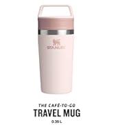
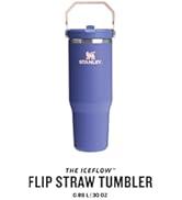
Yeni ürünlerimizi keşfedin
-
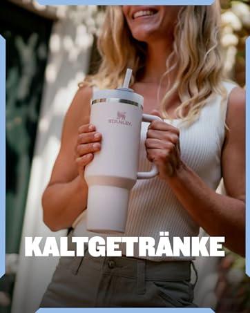
-
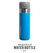
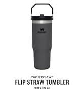
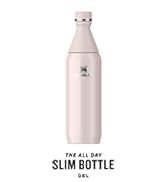
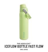
soğuk içecek şişeleri
Neden idefix?

Siparişinizi teslim aldığınız tarihten itibaren 14 gün içinde iade edebilir, iade sürecinin tamamlanmasının ardındansa ödemenizi hızla geri alabilirsiniz.

Kullanıcı dostu ara yüzümüz tüm ihtiyaçlarınıza eksiksiz yanıt verebilmek için tasarlandı. Deneyiminizi uçtan uca kusursuz kılmak adına çağrı merkezimiz ve canlı destek hattımızla ihtiyaç duyduğunuz her anda yanınızdayız!

Siparişlerinizin bir an önce ulaşması için sabırsızlandığınızın farkındayız. Sunduğumuz farklı teslimat seçenekleri arasından size en uygununu belirlemeniz, siparişinizi olabildiğince çabuk veya dilediğiniz zaman aralığında sorunsuz bir biçimde teslim etmemiz için yeterli.