




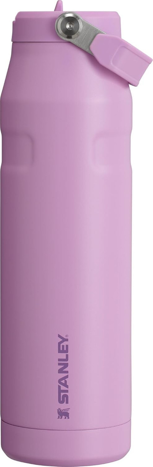


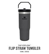
Stanley Iceflow™ Aerolight™ Flip Straw 2.0 Pipetli Termos Su Şişesi 1.06 Litre - Lilac | Paslanmaz Ç
Özellikler ve Spesifikasyonlar: Özellikleri: AeroLight birinci sınıf teknoloji, tüy ağırlıklı yalıtım, flip straw 2.0, Kapak Türü: Hasır Kapak, Kapaklı: Evet. Materyal ve Bakım: Malzeme: Paslanmaz Çelik, Ürün Bakım Talimatları: Elde Yıkama, Bulaşık makinesine dayanıklı mı?: Evet, Fırına Dayanıklı mı?: Hayır, Ürün mikrodalga fırın ile kullanıma uygun mu?: Hayır. Ölçümler: Kapasite: 36 sıvı ons, Ürün Boyutları G x Y: 25G x 25Y milimetre, Ürünün Ağırlığı: 1.21 Pound, Öğelerin Sayısı: 1. Stil: Renk: Lila, Desen: Düz, Tema: Açık Hava Etkinlikleri, Seyahat Hafif Performans için Premium AeroLight Teknolojisi: Standart paslanmaz çelik şişelere göre %33 daha hafif hale getiren AeroLight eğirilmiş çelik izolasyona sahip Stanley IceFlow Flip Straw 2.0 Şişe ile bir üst düzey hidrasyonu deneyimleyin. Bu tüy ağırlıklı tasarım, soğutma performansından ödün vermeden kolay taşınabilirlik sağlar, suyunuzu saatlerce ferahlatıcı bir şekilde soğuk tutar, günlük aktiviteleriniz veya yoğun egzersizleriniz sırasında nemli kalmak için mükemmeldir. Flip Straw 2.0 Kapaklı Geliştirilmiş Hidrasyon: Bu şişenin Flip Straw 2.0 kapağı, kolaylık ve hız için tasarlanmıştır. Daha büyük bir içecek açıklığı ve yerleşik bir pipet ile birlikte gelir, böylece daha hızlı ve daha kolay nemlendirebilirsiniz. Sadece yudumlamak için çevirin, sıkıca kapatın ve hareket halindeyken nemlendirme için şişeyi çantanıza veya araba bardaklığına kaydırın. Değiştirilebilir Mühürlü Sızdırmaz Kapak: Flip Straw 2.0 kapak, sızdırmaz olacak şekilde tasarlanmıştır ve içeceklerinizin kazara dökülme olmadan güvenli bir şekilde muhafaza edilmesini sağlar. Değiştirilebilir conta, şişenin uzun ömürlü olmasını sağlar ve uzun süre sızdırmaz performansın keyfini çıkarmanızı sağlar. Bu düşünceli tasarım özelliği, şişenin genel kullanılabilirliğini ve güvenilirliğini artırır. Bulaşık Makinesinde Yıkanabilir: Kullanıcı rahatlığı göz önünde bulundurularak tasarlanan IceFlow Flip Straw 2.0 Şişe, zahmetsiz temizlik için bulaşık makinesinde yıkanabilir. Ek olarak, yeni çıkış ağzı çıkarılabilir, bu da her seferinde hijyenik kullanım için temizlemeyi kolaylaştırır. İster spor salonunda, ister yolda veya işe gidip gelirken aktif yaşam tarzınız için ideal bir arkadaştır. Yaşam İçin Tasarlandı: 1913'ten bu yana, bir ömür boyu dayanacak şekilde inşa edilmiş, yiyecek ve içecek için sağlam, yetenekli ekipman sunacağımıza söz verdik. Hala tuttuğumuz bir söz.
.aplus-v2 .aplus-content-wrapper {
position: relative;
overflow: hidden;
}
.aplus-v2 .container-with-background-image {
width: 100%;
height: 100%;
background-repeat: no-repeat;
background-size: cover;
}
function logShoppableMetrics(moduleName, showsAddToCart) {
if (window.ue && window.ue.count) {
window.ue.count("aplus:shoppable:" + moduleName + ":addToCart", showsAddToCart ? 1 : 0);
}
}
Markadan
/*
* Used when device = desktop
* Configured in: configuration/brazil-config/global/brand-story.cfg
*/
/* Because the carousel is implemented as an ol list,
any lists in the card text will have a secondary list style (letters).
This will give an incorrect appearance to viewers,
so we set all lists to the primary list style (numbers). */
.aplus-brand-story-card ol li {
list-style: decimal;
}
/* Top level containers */
.aplus-module .apm-brand-story-hero {
-moz-box-sizing: border-box;
-webkit-box-sizing: border-box;
box-sizing: border-box;
width: 1464px;
height: 625px;
background-color: #fff;
}
.aplus-module .apm-brand-story-card {
-moz-box-sizing: border-box;
-webkit-box-sizing: border-box;
box-sizing: border-box;
width: 362px;
height: 453px;
background-color: var(--aok-sfs-color-page-primary-normal-bg, #fff);
}
.apm-brand-story-hero,
.apm-brand-story-card {
-moz-box-sizing: border-box;
-webkit-box-sizing: border-box;
box-sizing: border-box;
position: relative;
width: 100%;
height: 100%;
float: none;
}
.aplus-module.brand-story-card-1-four-asin .apm-brand-story-card {
/* Only 12px to account for image cell border */
padding: 12px;
}
/* Full background image (Hero 1 & Card 2) */
.aplus-module .apm-brand-story-background-image {
-moz-box-sizing: border-box;
-webkit-box-sizing: border-box;
box-sizing: border-box;
overflow: hidden;
position: absolute;
width: 100%;
height: 100%;
}
.aplus-module .apm-brand-story-background-image img {
display: block;
width: 100%;
height: 100%;
object-fit: cover;
}
/* Card 1 small images */
.aplus-module .apm-brand-story-image-grid {
-moz-box-sizing: border-box;
-webkit-box-sizing: border-box;
box-sizing: border-box;
padding: 0px;
margin: auto;
display: flex;
flex-flow: row wrap;
}
.aplus-module .apm-brand-story-image-grid .apm-brand-story-image-grid-item {
/* Use content-box to ensure image size matches editor schema */
-moz-box-sizing: content-box;
-webkit-box-sizing: content-box;
box-sizing: content-box;
padding: 0px;
margin: 2px;
width: 162px;
height: 185px;
border: 1px solid var(--aok-sfs-color-page-inverse-normal-border, #fff);
}
.aplus-module .apm-brand-story-image-grid .apm-brand-story-image-grid-item .apm-brand-story-image-link {
display: block;
width: 100%;
height: 100%;
padding: 2px;
}
.aplus-module .apm-brand-story-image-grid .apm-brand-story-image-grid-item .apm-brand-story-image-link .apm-brand-story-image-img {
display: block;
width: 100%;
height: 100%;
object-fit: cover;
}
/* Card 3 logo image */
.aplus-module .apm-brand-story-logo-image {
-moz-box-sizing: content-box;
-webkit-box-sizing: content-box;
box-sizing: content-box;
height: 145px;
margin: 0px 4px;
padding: 20px;
padding-bottom: 0px;
}
/* Text overlays */
.aplus-module .apm-brand-story-text-bottom {
-moz-box-sizing: border-box;
-webkit-box-sizing: border-box;
box-sizing: border-box;
position: absolute;
bottom: 13px;
left: 13px;
}
.aplus-module .apm-brand-story-hero .apm-brand-story-text-bottom {
background-color: rgba(0,0,0,0.6);
color: #fff;
padding: 13px 65px 13px 13px; /* accounts for overlap of first card */
width: 437px;
}
.aplus-module.brand-story-card-2-media-asset .apm-brand-story-text-bottom {
background-color: rgba(255,255,255,0.6);
color: #000;
padding: 13px;
width: 336px;
}
.aplus-module.brand-story-card-1-four-asin .apm-brand-story-text {
margin-top: 8px;
padding-left: 2px;
padding-right: 2px;
}
.aplus-module.brand-story-card-1-four-asin .apm-brand-story-text.apm-brand-story-text-single {
margin-top: 20px;
}
.aplus-module.brand-story-card-1-four-asin .apm-brand-story-text h3 {
white-space: nowrap;
overflow: hidden;
text-overflow: ellipsis;
}
.aplus-module .apm-brand-story-slogan-text {
-moz-box-sizing: content-box;
-webkit-box-sizing: content-box;
box-sizing: content-box;
margin: 0px 4px;
padding: 20px;
}
.aplus-module .apm-brand-story-faq {
-moz-box-sizing: content-box;
-webkit-box-sizing: content-box;
box-sizing: content-box;
padding-top: 10px;
}
.aplus-module .apm-brand-story-faq-block {
margin: 0px 10px;
padding: 10px;
}
.aplus-v2 .apm-brand-story-carousel-container {
position: relative;
}
.aplus-v2 .apm-brand-story-carousel-hero-container,
.aplus-v2 .apm-brand-story-carousel-hero-container > div {
position: absolute;
width: 100%;
}
/*
Ensuring the carousel takes only the space it needs.
The sizes need to be set again on the absolutely positioned elements so they can take up space.
*/
.aplus-v2 .apm-brand-story-carousel-container,
.aplus-v2 .apm-brand-story-carousel-hero-container {
height: 625px;
width: 100%;
max-width: 1464px;
margin-left: auto;
margin-right: auto;
overflow: hidden;
}
.aplus-v2 .apm-brand-story-carousel-hero-container,
.aplus-v2 .apm-brand-story-carousel-hero-container > div {
height: 625px;
}
.aplus-v2 .apm-brand-story-carousel.a-carousel-container {
padding: 0px;
}
/*
This centers the carousel vertically on top of the hero image container and after the logo area (125px).
Margin-top = (heroHeight - cardHeight - logoAreaHeight) / 2 + logoAreaHeight
*/
.aplus-v2 .apm-brand-story-carousel .a-carousel-row-inner {
margin-top: 149px;
}
/*
Cards need to have a width set, otherwise they default to 50px or so.
All cards must have the same width. The carousel will resize itself so all cards take the width of the largest card.
The left margin is for leaving a space between each card.
*/
.aplus-v2 .apm-brand-story-carousel .a-carousel-card {
width: 362px;
margin-left: 30px !important;
}
/* styling the navigation buttons so they are taller, flush with the sides, and have a clean white background */
.aplus-v2 .apm-brand-story-carousel .a-carousel-col.a-carousel-left,
.aplus-v2 .apm-brand-story-carousel .a-carousel-col.a-carousel-right {
padding: 0px;
}
.aplus-v2 .apm-brand-story-carousel .a-carousel-col.a-carousel-left .a-button-image,
.aplus-v2 .apm-brand-story-carousel .a-carousel-col.a-carousel-right .a-button-image {
border: none;
margin: 0px;
}
.aplus-v2 .apm-brand-story-carousel .a-carousel-col.a-carousel-left .a-button-image .a-button-inner,
.aplus-v2 .apm-brand-story-carousel .a-carousel-col.a-carousel-right .a-button-image .a-button-inner {
background: #fff;
padding: 20px 6px;
}
.aplus-v2 .apm-brand-story-carousel .a-carousel-col.a-carousel-left .a-button-image .a-button-inner {
border-radius: 0px 4px 4px 0px;
}
.aplus-v2 .apm-brand-story-carousel .a-carousel-col.a-carousel-right .a-button-image .a-button-inner {
border-radius: 4px 0px 0px 4px;
}

 Kolay İadeMüşteri Odaklı DeneyimHızlı ve Sorunsuz Teslimat
-
-

-
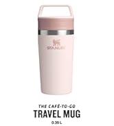
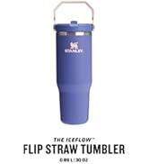
Yeni ürünlerimizi keşfedin
-
-

Neden idefix?

Siparişinizi teslim aldığınız tarihten itibaren 14 gün içinde iade edebilir, iade sürecinin tamamlanmasının ardındansa ödemenizi hızla geri alabilirsiniz.

Kullanıcı dostu ara yüzümüz tüm ihtiyaçlarınıza eksiksiz yanıt verebilmek için tasarlandı. Deneyiminizi uçtan uca kusursuz kılmak adına çağrı merkezimiz ve canlı destek hattımızla ihtiyaç duyduğunuz her anda yanınızdayız!

Siparişlerinizin bir an önce ulaşması için sabırsızlandığınızın farkındayız. Sunduğumuz farklı teslimat seçenekleri arasından size en uygununu belirlemeniz, siparişinizi olabildiğince çabuk veya dilediğiniz zaman aralığında sorunsuz bir biçimde teslim etmemiz için yeterli.