


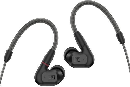
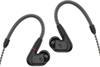
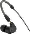
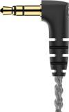


Sennheiser Ie 200 Kablolu Audiophile Stereo Kulaklık - Kablolu Kulak İçi Kulaklık - Net, Üstün Hi-Fi
-


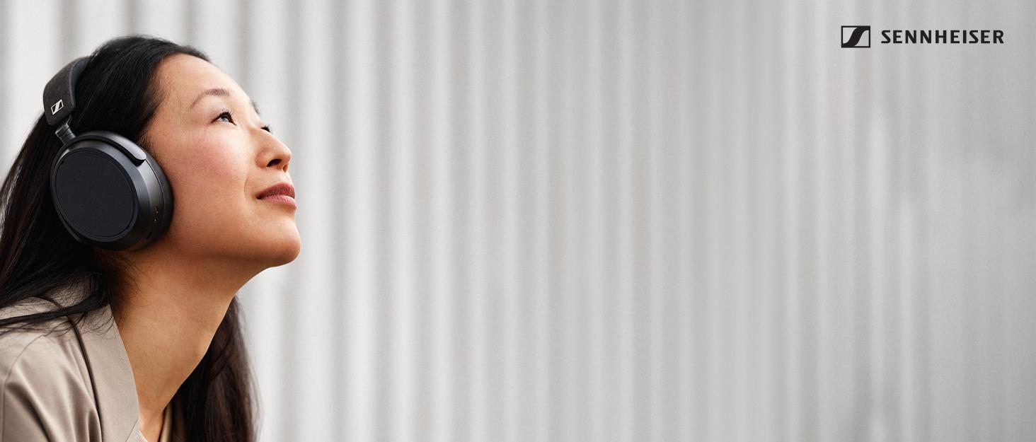
En iyi ses deneyimi için çabalayan ses uzmanları ve müzik severleriz. Alman Mühendisliği'nin zanaatı ve hassasiyeti sayesinde, sesin geleceğini sadece duymadığınız, aynı zamanda hissettiğiniz olağanüstü ses deneyimleriyle yeniden keşfetmek için yenilikçi ürünler yaratıyoruz. Sennheiser markasının 75 yıldan fazla bir süredir temsil ettiği şey budur.
-

Yoğun Bilim
Müşterilerimizin ihtiyaçlarını sürekli olarak yeniden keşfederek fark yaratan ses çözümleri yaratma tutkusuyla hareket ediyoruz.
-
Yoğun Ses
Sesi yeniden tanımlama yeteneğimiz normu belirlemeye devam etti ve dünya çapındaki müzik severlerin sesi yeni bir boyutta deneyimlemelerine izin verdi.
-
Yoğun Duygu
Ses fanatiği olarak, sadece duymakla kalmayıp aynı zamanda hissettiğiniz olağanüstü bir ses için çalışıyoruz. Başarımızı cildinizdeki tüylerim diken diken diken ile ölçüyoruz.
-
Sizi aşağıdaki dört kategoriye ayrılan çok çeşitli premium ses ürünlerimizi keşfetmeye davet ediyoruz: Premium Kulaklıklar, Audiophile Kulaklıklar, İşitme Çözümleri ve Ses Çubukları.
-
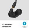
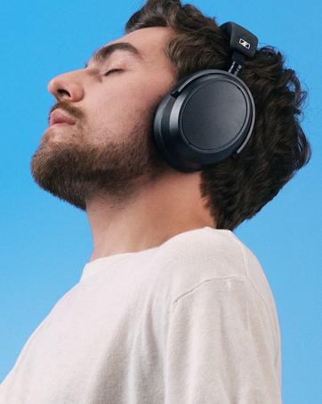
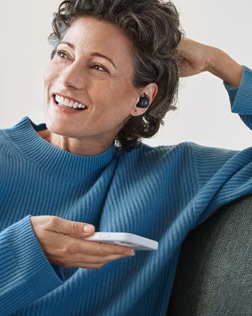
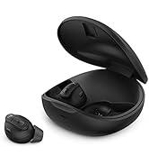
Premium Kulaklıklar
Nerede olursanız olun birinci sınıf müzik keyfi için True Wireless"tan Over-Ear"e kadar çok çeşitli kulaklık stilleri sunar.
-

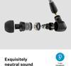
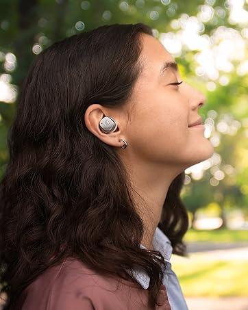
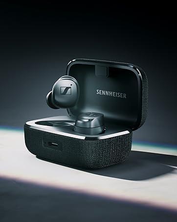
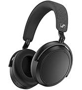
Audiophile Kulaklıklar
Hem ev hem de mobil dinleme için kulaklıklarla sürekli olarak yeni endüstri standartları tanımlamaya çalışmak.
-
İşitme Çözümleri
Pazar lideri gelişmiş işitme ürünleri sağlamaya çalışmak TV'den durumsal işitme dinlemek.
-
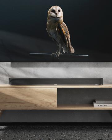
Soundbar'lar
Tek bir cihazla ev eğlencesi için olağanüstü sürükleyici ses deneyimleri sağlamak.
Neden idefix?

Siparişinizi teslim aldığınız tarihten itibaren 14 gün içinde iade edebilir, iade sürecinin tamamlanmasının ardındansa ödemenizi hızla geri alabilirsiniz.

Kullanıcı dostu ara yüzümüz tüm ihtiyaçlarınıza eksiksiz yanıt verebilmek için tasarlandı. Deneyiminizi uçtan uca kusursuz kılmak adına çağrı merkezimiz ve canlı destek hattımızla ihtiyaç duyduğunuz her anda yanınızdayız!

Siparişlerinizin bir an önce ulaşması için sabırsızlandığınızın farkındayız. Sunduğumuz farklı teslimat seçenekleri arasından size en uygununu belirlemeniz, siparişinizi olabildiğince çabuk veya dilediğiniz zaman aralığında sorunsuz bir biçimde teslim etmemiz için yeterli.