
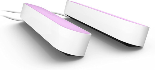
Hue Play 2'Li Ekopaket - Beyaz, 16 Milyona Kadar Renk, Uygulama Ile Kontrol Edilebilir, Amaz

Philips Hue Play 2'Li Ekopaket - Beyaz, 16 Milyona Kadar Renk, Uygulama Ile Kontrol Edilebilir, Amaz
Sepette İndirim
7.513,14 TL
8.838,99 TL
  • Ürün Açıklaması
  • Ürünün Özellikleri
  • Kampanyalar
  • İptal İade Koşulları
  • Taksit Bilgileri
  • Soru ve Cevap (0)

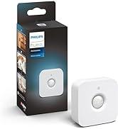
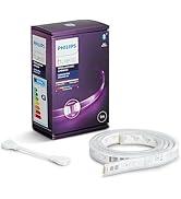
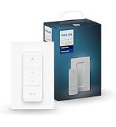
  • Philips Hue Play ikili paketi, Hue portföyündeki en çok yönlü ışıktır ve kompakt tasarımıyla etkileyicidir. Kontrol için bir Hue kısma anahtarı veya bir Hue köprüsü gereklidir (dahil değildir).
  • Lamba, yaşam alanındaki ortam aydınlatması için çok uygundur, göz kamaştırmaz.
  • Renk sıcaklığı: 2.000 ila 6.500 Kelvin. Hue uygulamasındaki 16 milyon renk arasından seçim yapabilir ve ışığı Hue Sync aracılığıyla müzik, film ve video oyunlarıyla senkronize edebilirsiniz.
  • 2 metre kablo uzunluğuna sahip olan Hue Play, zemine monte edilmiş, dolap arkasına veya doğrudan TV’nin arkasına monte edilmiş olarak birçok şekilde konumlandırılabilir, yatay ve dikey konumlandırma mümkündür.
  • Sesli kumanda için Amazon Alexa ile (Echo/Echo Dot ve gerekli Hue Bridge ayrı satılır) çalışır (Türkçe desteklemeyebilir). Eviniz için akıllı ev deneyimi. Bu ürün, içinde bir çok farklı aydınlatma özelliği barındırır. İçinde bir çok farklı aydınlatma özelliği barındıran lambalar, mevcut ışık kaynağının ayrı kontrolü için sökülebilen lambalardır. Bu ürün, enerji verimliliği sınıfı G olan bir ışık kaynağı içerir.
  • Markadan
    .aplus-v2 .container-with-background-image { width: 100%; height: 100%; background-repeat: no-repeat; background-size: cover; } function logShoppableMetrics(moduleName, showsAddToCart) { if (window.ue && window.ue.count) { window.ue.count("aplus:shoppable:" + moduleName + ":addToCart", showsAddToCart ? 1 : 0); } }
    /* * Used when device = desktop * Configured in: configuration/brazil-config/global/brand-story.cfg */ /* Because the carousel is implemented as an ol list, any lists in the card text will have a secondary list style (letters). This will give an incorrect appearance to viewers, so we set all lists to the primary list style (numbers). */ .aplus-brand-story-card ol li { list-style: decimal; } /* Top level containers */ .aplus-module .apm-brand-story-hero { -moz-box-sizing: border-box; -webkit-box-sizing: border-box; box-sizing: border-box; width: 1464px; height: 625px; background-color: #fff; } .aplus-module .apm-brand-story-card { -moz-box-sizing: border-box; -webkit-box-sizing: border-box; box-sizing: border-box; width: 362px; height: 453px; background-color: #fff; } .apm-brand-story-hero, .apm-brand-story-card { -moz-box-sizing: border-box; -webkit-box-sizing: border-box; box-sizing: border-box; position: relative; width: 100%; height: 100%; float: none; } .aplus-module.brand-story-card-1-four-asin .apm-brand-story-card { /* Only 12px to account for image cell border */ padding: 12px; } /* Full background image (Hero 1 & Card 2) */ .aplus-module .apm-brand-story-background-image { -moz-box-sizing: border-box; -webkit-box-sizing: border-box; box-sizing: border-box; overflow: hidden; position: absolute; width: 100%; height: 100%; } .aplus-module .apm-brand-story-background-image img { display: block; width: 100%; height: 100%; object-fit: cover; } /* Card 1 small images */ .aplus-module .apm-brand-story-image-grid { -moz-box-sizing: border-box; -webkit-box-sizing: border-box; box-sizing: border-box; padding: 0px; margin: auto; display: flex; flex-flow: row wrap; } .aplus-module .apm-brand-story-image-grid .apm-brand-story-image-grid-item { /* Use content-box to ensure image size matches editor schema */ -moz-box-sizing: content-box; -webkit-box-sizing: content-box; box-sizing: content-box; padding: 0px; margin: 2px; width: 162px; height: 185px; border: 1px solid #fff; } .aplus-module .apm-brand-story-image-grid .apm-brand-story-image-grid-item .apm-brand-story-image-link { display: block; width: 100%; height: 100%; padding: 2px; } .aplus-module .apm-brand-story-image-grid .apm-brand-story-image-grid-item .apm-brand-story-image-link .apm-brand-story-image-img { display: block; width: 100%; height: 100%; object-fit: cover; } /* Card 3 logo image */ .aplus-module .apm-brand-story-logo-image { -moz-box-sizing: content-box; -webkit-box-sizing: content-box; box-sizing: content-box; height: 145px; margin: 0px 4px; padding: 20px; padding-bottom: 0px; } /* Text overlays */ .aplus-module .apm-brand-story-text-bottom { -moz-box-sizing: border-box; -webkit-box-sizing: border-box; box-sizing: border-box; position: absolute; bottom: 13px; left: 13px; } .aplus-module .apm-brand-story-hero .apm-brand-story-text-bottom { background-color: rgba(0,0,0,0.6); color: #fff; padding: 13px 65px 13px 13px; /* accounts for overlap of first card */ width: 437px; } .aplus-module.brand-story-card-2-media-asset .apm-brand-story-text-bottom { background-color: rgba(255,255,255,0.6); color: #000; padding: 13px; width: 336px; } .aplus-module.brand-story-card-1-four-asin .apm-brand-story-text { margin-top: 8px; padding-left: 2px; padding-right: 2px; } .aplus-module.brand-story-card-1-four-asin .apm-brand-story-text.apm-brand-story-text-single { margin-top: 20px; } .aplus-module.brand-story-card-1-four-asin .apm-brand-story-text h3 { white-space: nowrap; overflow: hidden; text-overflow: ellipsis; } .aplus-module .apm-brand-story-slogan-text { -moz-box-sizing: content-box; -webkit-box-sizing: content-box; box-sizing: content-box; margin: 0px 4px; padding: 20px; } .aplus-module .apm-brand-story-faq { -moz-box-sizing: content-box; -webkit-box-sizing: content-box; box-sizing: content-box; padding-top: 10px; } .aplus-module .apm-brand-story-faq-block { margin: 0px 10px; padding: 10px; } .aplus-v2 .apm-brand-story-carousel-container { position: relative; } .aplus-v2 .apm-brand-story-carousel-hero-container, .aplus-v2 .apm-brand-story-carousel-hero-container > div { position: absolute; width: 100%; } /* Ensuring the carousel takes only the space it needs. The sizes need to be set again on the absolutely positioned elements so they can take up space. */ .aplus-v2 .apm-brand-story-carousel-container, .aplus-v2 .apm-brand-story-carousel-hero-container { height: 625px; width: 100%; max-width: 1464px; margin-left: auto; margin-right: auto; overflow: hidden; } .aplus-v2 .apm-brand-story-carousel-hero-container, .aplus-v2 .apm-brand-story-carousel-hero-container > div { height: 625px; } .aplus-v2 .apm-brand-story-carousel.a-carousel-container { padding: 0px; } /* This centers the carousel vertically on top of the hero image container and after the logo area (125px). Margin-top = (heroHeight - cardHeight - logoAreaHeight) / 2 + logoAreaHeight */ .aplus-v2 .apm-brand-story-carousel .a-carousel-row-inner { margin-top: 149px; } /* Cards need to have a width set, otherwise they default to 50px or so. All cards must have the same width. The carousel will resize itself so all cards take the width of the largest card. The left margin is for leaving a space between each card. */ .aplus-v2 .apm-brand-story-carousel .a-carousel-card { width: 362px; margin-left: 30px !important; } /* styling the navigation buttons so they are taller, flush with the sides, and have a clean white background */ .aplus-v2 .apm-brand-story-carousel .a-carousel-col.a-carousel-left, .aplus-v2 .apm-brand-story-carousel .a-carousel-col.a-carousel-right { padding: 0px; } .aplus-v2 .apm-brand-story-carousel .a-carousel-col.a-carousel-left .a-button-image, .aplus-v2 .apm-brand-story-carousel .a-carousel-col.a-carousel-right .a-button-image { border: none; margin: 0px; } .aplus-v2 .apm-brand-story-carousel .a-carousel-col.a-carousel-left .a-button-image .a-button-inner, .aplus-v2 .apm-brand-story-carousel .a-carousel-col.a-carousel-right .a-button-image .a-button-inner { background: #fff; padding: 20px 6px; } .aplus-v2 .apm-brand-story-carousel .a-carousel-col.a-carousel-left .a-button-image .a-button-inner { border-radius: 0px 4px 4px 0px; } .aplus-v2 .apm-brand-story-carousel .a-carousel-col.a-carousel-right .a-button-image .a-button-inner { border-radius: 4px 0px 0px 4px; }
    (function(f) {var _np=(window.P._namespace("BrandStoryAplusModule"));if(_np.guardFatal){_np.guardFatal(f)(_np);}else{f(_np);}}(function(P) { P.when('brand-story-carousel').execute("init-brand-story-carousel", function (init) { init(); }); }));