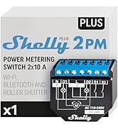

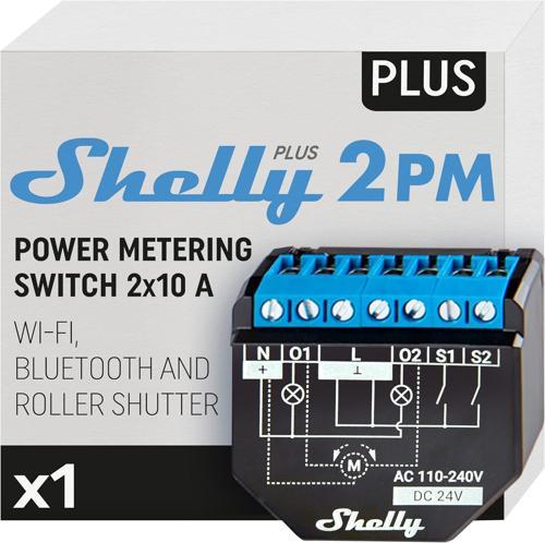





Shelly Plus 2Pm | Wi-Fi Ve Bluetooth 2 Kanallı Akıllı Röle Anahtarı, Güç Ölçümlü | Ev Otomasyonu | P
Nikon Shelly Plus 2Pm | Wi-Fi Ve Bluetooth 2 Kanallı Akıllı Röle Anahtarı, Güç Ölçümlü | Ev Otomasyonu | P

  • Ürün Açıklaması
  • Ürünün Özellikleri
  • İptal İade Koşulları
  • Soru ve Cevap (0)

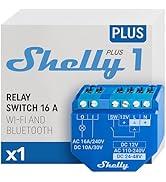
  • Shelly Plus 2PM, Wi-Fi ve Bluetooth ile çalışan akıllı bir şalter rölesidir, 2 kanallı, 16 A'ya (18 A uç) kadar güç ölçümü, WLAN tekrarlayıcı olarak da kullanılabilir; Shelly Plus 2PM tüketimi izlemek ve tüm ev aletleri, elektrik devreleri ve ofis cihazlarının kontrolünü kişisel olarak ele almak için kullanılabilir
  • Elektrik tüketiminizi takip edin - Artık otomatik cihazlarınızın enerji tüketimini izleyebilir ve analiz edebilir ve tüketiminizi yönetebilirsiniz; Shelly Plus 2PM, her kanal için tüketimi ayrı ayrı izleyebileceğiniz iki entegre hassas elektrik sayacına sahiptir; ücretsiz kaydedilen tüketim verileri harcamalarınızı tahmin etmenize yardımcı olur ve her ev sahibinin elektrik maliyetlerini düşürmesini sağlar. ken ken
  • 2 elektrikli cihazı bir cihazla kontrol edin - Shelly Plus 2PM iki farklı akım devresini kontrol etmenizi ve tüketimini ayrı ayrı izlemenizi sağlar; bu şekilde sadece bir cihaz ile aynı fazda iki farklı lambayı kontrol edebilirsiniz, bu da ek enerji tasarrufu sağlar; Shelly Plus 2PM kapak kontrolünü destekler ve perdelerin, panjurların otomasyonu için mükemmeldir. Garaj kapıları, mark. evinizdeki diğer çift yönlü motorlar için.
  • SHELLY Müşteri hizmetleri - Shelly özel evlerin, binaların ve işletmelerin otomasyonu için çözümler sunan cihazlarla dünyanın en hızlı büyüyen akıllı ev markalarından biridir
  • Shell Smart Control uygulaması ile Shelly cihazlarınızı uzaktan kontrol edebilir ve evinizdeki tüm otomatik olaylar hakkında bilgilendirilebilir; cihazları kolayca yapılandırabilir ve ayarlarını tek tek yönetebilirsiniz veya ev otomasyonunuzdaki belirli eylemleri tetiklemek için Shelly cihazlarını birleştirerek kişiselleştirilmiş sahneler oluşturabilirsiniz
  • Markadan
    .aplus-v2 .container-with-background-image { width: 100%; height: 100%; background-repeat: no-repeat; background-size: cover; } function logShoppableMetrics(moduleName, showsAddToCart) { if (window.ue && window.ue.count) { window.ue.count("aplus:shoppable:" + moduleName + ":addToCart", showsAddToCart ? 1 : 0); } }
    /* * Used when device = desktop * Configured in: configuration/brazil-config/global/brand-story.cfg */ /* Because the carousel is implemented as an ol list, any lists in the card text will have a secondary list style (letters). This will give an incorrect appearance to viewers, so we set all lists to the primary list style (numbers). */ .aplus-brand-story-card ol li { list-style: decimal; } /* Top level containers */ .aplus-module .apm-brand-story-hero { -moz-box-sizing: border-box; -webkit-box-sizing: border-box; box-sizing: border-box; width: 1464px; height: 625px; background-color: #fff; } .aplus-module .apm-brand-story-card { -moz-box-sizing: border-box; -webkit-box-sizing: border-box; box-sizing: border-box; width: 362px; height: 453px; background-color: #fff; } .apm-brand-story-hero, .apm-brand-story-card { -moz-box-sizing: border-box; -webkit-box-sizing: border-box; box-sizing: border-box; position: relative; width: 100%; height: 100%; float: none; } .aplus-module.brand-story-card-1-four-asin .apm-brand-story-card { /* Only 12px to account for image cell border */ padding: 12px; } /* Full background image (Hero 1 & Card 2) */ .aplus-module .apm-brand-story-background-image { -moz-box-sizing: border-box; -webkit-box-sizing: border-box; box-sizing: border-box; overflow: hidden; position: absolute; width: 100%; height: 100%; } .aplus-module .apm-brand-story-background-image img { display: block; width: 100%; height: 100%; object-fit: cover; } /* Card 1 small images */ .aplus-module .apm-brand-story-image-grid { -moz-box-sizing: border-box; -webkit-box-sizing: border-box; box-sizing: border-box; padding: 0px; margin: auto; display: flex; flex-flow: row wrap; } .aplus-module .apm-brand-story-image-grid .apm-brand-story-image-grid-item { /* Use content-box to ensure image size matches editor schema */ -moz-box-sizing: content-box; -webkit-box-sizing: content-box; box-sizing: content-box; padding: 0px; margin: 2px; width: 162px; height: 185px; border: 1px solid #fff; } .aplus-module .apm-brand-story-image-grid .apm-brand-story-image-grid-item .apm-brand-story-image-link { display: block; width: 100%; height: 100%; padding: 2px; } .aplus-module .apm-brand-story-image-grid .apm-brand-story-image-grid-item .apm-brand-story-image-link .apm-brand-story-image-img { display: block; width: 100%; height: 100%; object-fit: cover; } /* Card 3 logo image */ .aplus-module .apm-brand-story-logo-image { -moz-box-sizing: content-box; -webkit-box-sizing: content-box; box-sizing: content-box; height: 145px; margin: 0px 4px; padding: 20px; padding-bottom: 0px; } /* Text overlays */ .aplus-module .apm-brand-story-text-bottom { -moz-box-sizing: border-box; -webkit-box-sizing: border-box; box-sizing: border-box; position: absolute; bottom: 13px; left: 13px; } .aplus-module .apm-brand-story-hero .apm-brand-story-text-bottom { background-color: rgba(0,0,0,0.6); color: #fff; padding: 13px 65px 13px 13px; /* accounts for overlap of first card */ width: 437px; } /* [TODO][AplusMantle-10079] Remove this temporary CSS selector after other team on DPX removes their cascading CSS */ #aplusBrandStory_feature_div .aplus-module .apm-brand-story-hero .apm-brand-story-text-bottom h3 { color: #fff !important; } .aplus-module.brand-story-card-2-media-asset .apm-brand-story-text-bottom { background-color: rgba(255,255,255,0.6); color: #000; padding: 13px; width: 336px; } .aplus-module.brand-story-card-1-four-asin .apm-brand-story-text { margin-top: 8px; padding-left: 2px; padding-right: 2px; } .aplus-module.brand-story-card-1-four-asin .apm-brand-story-text.apm-brand-story-text-single { margin-top: 20px; } .aplus-module.brand-story-card-1-four-asin .apm-brand-story-text h3 { white-space: nowrap; overflow: hidden; text-overflow: ellipsis; } .aplus-module .apm-brand-story-slogan-text { -moz-box-sizing: content-box; -webkit-box-sizing: content-box; box-sizing: content-box; margin: 0px 4px; padding: 20px; } .aplus-module .apm-brand-story-faq { -moz-box-sizing: content-box; -webkit-box-sizing: content-box; box-sizing: content-box; padding-top: 10px; } .aplus-module .apm-brand-story-faq-block { margin: 0px 10px; padding: 10px; } .aplus-v2 .apm-brand-story-carousel-container { position: relative; } .aplus-v2 .apm-brand-story-carousel-hero-container, .aplus-v2 .apm-brand-story-carousel-hero-container > div { position: absolute; width: 100%; } /* Ensuring the carousel takes only the space it needs. The sizes need to be set again on the absolutely positioned elements so they can take up space. */ .aplus-v2 .apm-brand-story-carousel-container, .aplus-v2 .apm-brand-story-carousel-hero-container { height: 625px; width: 100%; max-width: 1464px; margin-left: auto; margin-right: auto; overflow: hidden; } .aplus-v2 .apm-brand-story-carousel-hero-container, .aplus-v2 .apm-brand-story-carousel-hero-container > div { height: 625px; } .aplus-v2 .apm-brand-story-carousel.a-carousel-container { padding: 0px; } /* This centers the carousel vertically on top of the hero image container and after the logo area (125px). Margin-top = (heroHeight - cardHeight - logoAreaHeight) / 2 + logoAreaHeight */ .aplus-v2 .apm-brand-story-carousel .a-carousel-row-inner { margin-top: 149px; } /* Cards need to have a width set, otherwise they default to 50px or so. All cards must have the same width. The carousel will resize itself so all cards take the width of the largest card. The left margin is for leaving a space between each card. */ .aplus-v2 .apm-brand-story-carousel .a-carousel-card { width: 362px; margin-left: 30px !important; } /* styling the navigation buttons so they are taller, flush with the sides, and have a clean white background */ .aplus-v2 .apm-brand-story-carousel .a-carousel-col.a-carousel-left, .aplus-v2 .apm-brand-story-carousel .a-carousel-col.a-carousel-right { padding: 0px; } .aplus-v2 .apm-brand-story-carousel .a-carousel-col.a-carousel-left .a-button-image, .aplus-v2 .apm-brand-story-carousel .a-carousel-col.a-carousel-right .a-button-image { border: none; margin: 0px; } .aplus-v2 .apm-brand-story-carousel .a-carousel-col.a-carousel-left .a-button-image .a-button-inner, .aplus-v2 .apm-brand-story-carousel .a-carousel-col.a-carousel-right .a-button-image .a-button-inner { background: #fff; padding: 20px 6px; } .aplus-v2 .apm-brand-story-carousel .a-carousel-col.a-carousel-left .a-button-image .a-button-inner { border-radius: 0px 4px 4px 0px; } .aplus-v2 .apm-brand-story-carousel .a-carousel-col.a-carousel-right .a-button-image .a-button-inner { border-radius: 4px 0px 0px 4px; }