


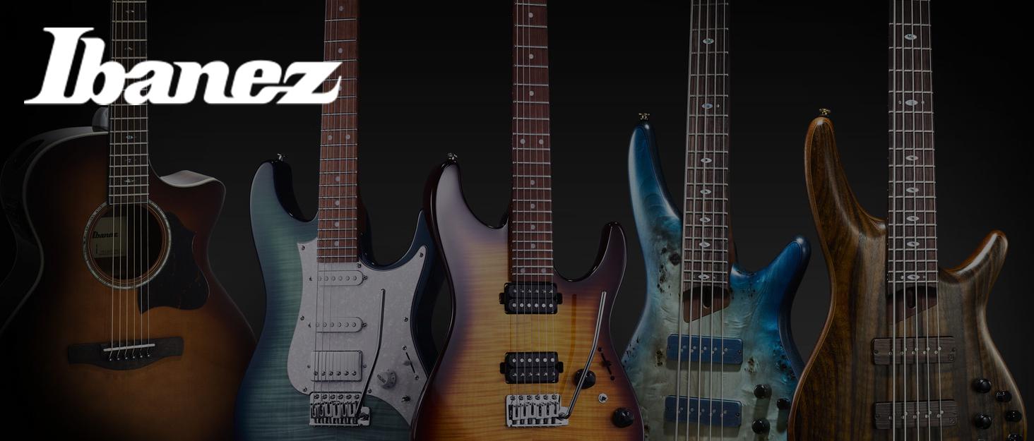
Ibanez
Kuruluşundan beri, Ibanez, dünya çapında müzisyenlere ilham veren gitarlar üretti, geleneği modern yenilikle harmanlamak.
-


Onlarca Yıllık İşçilik
Uzun tarihi boyunca, Ibanez dünyanın en güvenilir gitar markalarından biri haline geldi. Kalıcı Japon işçiliğini sürekli yenilikle birleştirmek, Ibanez enstrümanları rock sesinin şekillenmesine yardımcı oldu, metal, caz, ve nesiller boyunca blues.
-
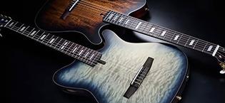
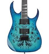
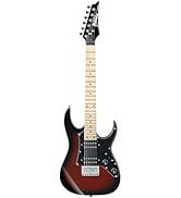
Sınırları Zorlamak
Şık RG ve S Serisinden öncü 7- ve 8 telli gitarlar, Ibanez her zaman tasarımın ön saflarında yer almıştır. Enstrümanlarımız konfor, hız ve ton için üretilmiştir - yeni başlayanlar, profesyoneller ve efsaneler tarafından güvenilir.
-

Simgeler tarafından güvenilen
Steve Vai, Joe Satriani, George Benson, Paul Gilbert, Tosin Abasi ve daha birçok dünyaca ünlü müzisyen Ibanez'i seçiyor.
-

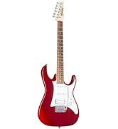
Senin sesin, Ibanez"in
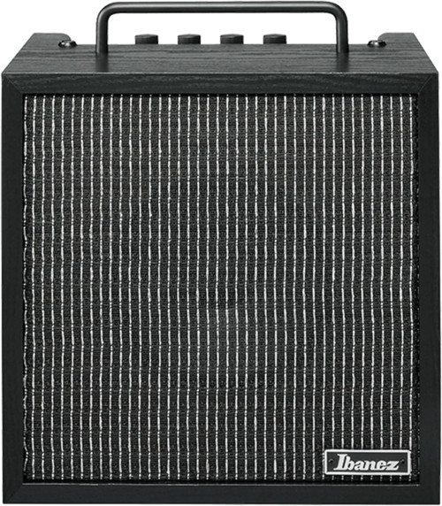
Elektrik ve akustikten bas ve pedallara, Ibanez her stil ve oyuncu için enstrümanlar sunuyor. İster ilk akorlarınızı öğreniyor olun, ister bir festivalin başrolünü çiziyor olun, Ibanez size benzersiz sesinizi yaratmanız için araçlar sunar.
-
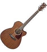
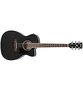
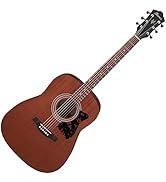
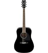
Akustik Gitarlar
-

Neden idefix?

Siparişinizi teslim aldığınız tarihten itibaren 14 gün içinde iade edebilir, iade sürecinin tamamlanmasının ardındansa ödemenizi hızla geri alabilirsiniz.

Kullanıcı dostu ara yüzümüz tüm ihtiyaçlarınıza eksiksiz yanıt verebilmek için tasarlandı. Deneyiminizi uçtan uca kusursuz kılmak adına çağrı merkezimiz ve canlı destek hattımızla ihtiyaç duyduğunuz her anda yanınızdayız!

Siparişlerinizin bir an önce ulaşması için sabırsızlandığınızın farkındayız. Sunduğumuz farklı teslimat seçenekleri arasından size en uygununu belirlemeniz, siparişinizi olabildiğince çabuk veya dilediğiniz zaman aralığında sorunsuz bir biçimde teslim etmemiz için yeterli.