



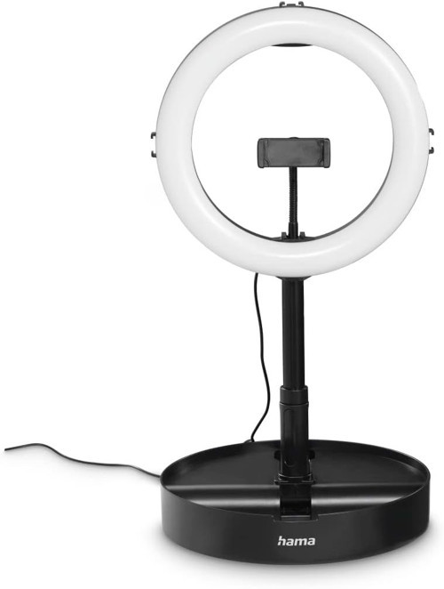


Hama Led Halka Lamba, Tripodlu, Cep Telefonu Katlanabilir (10,2 Inç Halka Lamba, 26,5 Cm Çap, Masa T
7.070,99 TL
Özellikler ve Spesifikasyonlar: Bağlantı Teknolojiisi: USB, Donanım Arabirimi: USB, Uyumlu Flaş Yuvası Montaj Tipi: Mekanik Aksesuar Yuvası, Otomatik Zamanlaması Var: Hayır, Su Geçirmezlik Düzeyi: Suya Dayanıklı Değil Cep telefonu tutuculu halka ışık: Bilyeli başlıklı ve esnek kuğu boynuna sahip akıllı telefon tutucu sayesinde her zaman mükemmel çekim pozisyonu, kelepçeli yaylı tutucu sayesinde 6,0 – 8,0 cm genişliğindeki cep telefonları için uygundur Tripodlu yuvarlak ışık: Kompakt selfie ışığı, 10,2 inç (dış çap 26,5 cm) ve kablolu uzaktan kumanda, lamba tripod küre kafasına eğilebilir, 138 cm'ye kadar yüksekliği ayarlanabilir, yer kaplamadan katlanabilir 128 LED'li ayarlanabilir masa halkası ışığı: Renk sıcaklığı sıcak beyazdan gün ışığına kadar 3 kademede ayarlanabilir, ışık yoğunluğu 10 kademede kısılabilir parlak ışıktan hoş kısma kadar Diğer aksesuarlar için bağlantı olanakları: Her tarafta üç ¼ inç ve dört Cold-Shoe bağlantısı, örneğin mikrofon ve web kamerası için, halka ışığın USB A kablosu üzerinden güç kaynağı (1,9 m) Teslimat kapsamı: 1 x katlanabilir LED halka lamba "SpotLight FoldUp 102 II" kablolu uzaktan kumandalı, 1 x akıllı telefon tutuculu kuğu boynu, 1 x soğuk ayakkabı 1/4 inç adaptör, 1 x taşıma çantası, 1 x kılavuz (Türkçe olmayabilir)
.aplus-v2 .aplus-content-wrapper {
position: relative;
overflow: hidden;
}
.aplus-v2 .container-with-background-image {
width: 100%;
height: 100%;
background-repeat: no-repeat;
background-size: cover;
}
.aplus-v2 .aplus-module-csa-wrapper {
display: flow-root;
}
function logShoppableMetrics(moduleName, showsAddToCart) {
if (window.ue && window.ue.count) {
window.ue.count("aplus:shoppable:" + moduleName + ":addToCart", showsAddToCart ? 1 : 0);
}
}
Markadan
/*
* Used when device = desktop
* Configured in: configuration/brazil-config/global/brand-story.cfg
*/
/* Because the carousel is implemented as an ol list,
any lists in the card text will have a secondary list style (letters).
This will give an incorrect appearance to viewers,
so we set all lists to the primary list style (numbers). */
.aplus-brand-story-card ol li {
list-style: decimal;
}
/* Top level containers */
.aplus-module .apm-brand-story-hero {
-moz-box-sizing: border-box;
-webkit-box-sizing: border-box;
box-sizing: border-box;
width: 1464px;
height: 625px;
background-color: #fff;
}
.aplus-module .apm-brand-story-card {
-moz-box-sizing: border-box;
-webkit-box-sizing: border-box;
box-sizing: border-box;
width: 362px;
height: 453px;
background-color: var(--aok-sfs-color-page-primary-normal-bg, #fff);
}
.apm-brand-story-hero,
.apm-brand-story-card {
-moz-box-sizing: border-box;
-webkit-box-sizing: border-box;
box-sizing: border-box;
position: relative;
width: 100%;
height: 100%;
float: none;
}
.aplus-module.brand-story-card-1-four-asin .apm-brand-story-card {
/* Only 12px to account for image cell border */
padding: 12px;
}
/* Full background image (Hero 1 & Card 2) */
.aplus-module .apm-brand-story-background-image {
-moz-box-sizing: border-box;
-webkit-box-sizing: border-box;
box-sizing: border-box;
overflow: hidden;
position: absolute;
width: 100%;
height: 100%;
}
.aplus-module .apm-brand-story-background-image img {
display: block;
width: 100%;
height: 100%;
object-fit: cover;
}
/* Card 1 small images */
.aplus-module .apm-brand-story-image-grid {
-moz-box-sizing: border-box;
-webkit-box-sizing: border-box;
box-sizing: border-box;
padding: 0px;
margin: auto;
display: flex;
flex-flow: row wrap;
}
.aplus-module .apm-brand-story-image-grid .apm-brand-story-image-grid-item {
/* Use content-box to ensure image size matches editor schema */
-moz-box-sizing: content-box;
-webkit-box-sizing: content-box;
box-sizing: content-box;
padding: 0px;
margin: 2px;
width: 162px;
height: 185px;
border: 1px solid var(--aok-sfs-color-page-inverse-normal-border, #fff);
}
.aplus-module .apm-brand-story-image-grid .apm-brand-story-image-grid-item .apm-brand-story-image-link {
display: block;
width: 100%;
height: 100%;
padding: 2px;
}
.aplus-module .apm-brand-story-image-grid .apm-brand-story-image-grid-item .apm-brand-story-image-link .apm-brand-story-image-img {
display: block;
width: 100%;
height: 100%;
object-fit: cover;
}
/* Card 3 logo image */
.aplus-module .apm-brand-story-logo-image {
-moz-box-sizing: content-box;
-webkit-box-sizing: content-box;
box-sizing: content-box;
height: 145px;
margin: 0px 4px;
padding: 20px;
padding-bottom: 0px;
}
/* Text overlays */
.aplus-module .apm-brand-story-text-bottom {
-moz-box-sizing: border-box;
-webkit-box-sizing: border-box;
box-sizing: border-box;
position: absolute;
bottom: 13px;
left: 13px;
}
.aplus-module .apm-brand-story-hero .apm-brand-story-text-bottom {
background-color: rgba(0,0,0,0.6);
color: #fff;
padding: 13px 65px 13px 13px; /* accounts for overlap of first card */
width: 437px;
}
.aplus-module.brand-story-card-2-media-asset .apm-brand-story-text-bottom {
background-color: rgba(255,255,255,0.6);
color: #000;
padding: 13px;
width: 336px;
}
.aplus-module.brand-story-card-1-four-asin .apm-brand-story-text {
margin-top: 8px;
padding-left: 2px;
padding-right: 2px;
}
.aplus-module.brand-story-card-1-four-asin .apm-brand-story-text.apm-brand-story-text-single {
margin-top: 20px;
}
.aplus-module.brand-story-card-1-four-asin .apm-brand-story-text h3 {
white-space: nowrap;
overflow: hidden;
text-overflow: ellipsis;
}
.aplus-module .apm-brand-story-slogan-text {
-moz-box-sizing: content-box;
-webkit-box-sizing: content-box;
box-sizing: content-box;
margin: 0px 4px;
padding: 20px;
}
.aplus-module .apm-brand-story-faq {
-moz-box-sizing: content-box;
-webkit-box-sizing: content-box;
box-sizing: content-box;
padding-top: 10px;
}
.aplus-module .apm-brand-story-faq-block {
margin: 0px 10px;
padding: 10px;
}
.aplus-v2 .apm-brand-story-carousel-container {
position: relative;
}
.aplus-v2 .apm-brand-story-carousel-hero-container,
.aplus-v2 .apm-brand-story-carousel-hero-container > div {
position: absolute;
width: 100%;
}
/*
Ensuring the carousel takes only the space it needs.
The sizes need to be set again on the absolutely positioned elements so they can take up space.
*/
.aplus-v2 .apm-brand-story-carousel-container,
.aplus-v2 .apm-brand-story-carousel-hero-container {
height: 625px;
width: 100%;
max-width: 1464px;
margin-left: auto;
margin-right: auto;
overflow: hidden;
}
.aplus-v2 .apm-brand-story-carousel-hero-container,
.aplus-v2 .apm-brand-story-carousel-hero-container > div {
height: 625px;
}
.aplus-v2 .apm-brand-story-carousel.a-carousel-container {
padding: 0px;
}
/*
This centers the carousel vertically on top of the hero image container and after the logo area (125px).
Margin-top = (heroHeight - cardHeight - logoAreaHeight) / 2 + logoAreaHeight
*/
.aplus-v2 .apm-brand-story-carousel .a-carousel-row-inner {
margin-top: 149px;
}
/*
Cards need to have a width set, otherwise they default to 50px or so.
All cards must have the same width. The carousel will resize itself so all cards take the width of the largest card.
The left margin is for leaving a space between each card.
*/
.aplus-v2 .apm-brand-story-carousel .a-carousel-card {
width: 362px;
margin-left: 30px !important;
}
/* styling the navigation buttons so they are taller, flush with the sides, and have a clean white background */
.aplus-v2 .apm-brand-story-carousel .a-carousel-col.a-carousel-left,
.aplus-v2 .apm-brand-story-carousel .a-carousel-col.a-carousel-right {
padding: 0px;
}
.aplus-v2 .apm-brand-story-carousel .a-carousel-col.a-carousel-left .a-button-image,
.aplus-v2 .apm-brand-story-carousel .a-carousel-col.a-carousel-right .a-button-image {
border: none;
margin: 0px;
}
.aplus-v2 .apm-brand-story-carousel .a-carousel-col.a-carousel-left .a-button-image .a-button-inner,
.aplus-v2 .apm-brand-story-carousel .a-carousel-col.a-carousel-right .a-button-image .a-button-inner {
background: #fff;
padding: 20px 6px;
}
.aplus-v2 .apm-brand-story-carousel .a-carousel-col.a-carousel-left .a-button-image .a-button-inner {
border-radius: 0px 4px 4px 0px;
}
.aplus-v2 .apm-brand-story-carousel .a-carousel-col.a-carousel-right .a-button-image .a-button-inner {
border-radius: 4px 0px 0px 4px;
}

 (function(f) {var _np=(window.P._namespace("BrandStoryAplusModule"));if(_np.guardFatal){_np.guardFatal(f)(_np);}else{f(_np);}}(function(P) {
P.when('brand-story-carousel').execute("init-brand-story-carousel", function (init) {
init();
});
}));
(function(f) {var _np=(window.P._namespace("BrandStoryAplusModule"));if(_np.guardFatal){_np.guardFatal(f)(_np);}else{f(_np);}}(function(P) {
P.when('brand-story-carousel').execute("init-brand-story-carousel", function (init) {
init();
});
}));




| Marka | Hama |
| Bağlanabilirlik Teknolojisi | USB |
| Donanım Arayüzü | USB |
| Ürün Boyutları | 29U x 7.5G x 27.5Y santimetre |


