


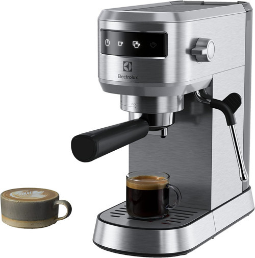


Electrolux E6Ec1-6St Explorer 6 Espresso Cappuccino Kahve Makinesi | Isı Kontrol Teknolojisi, Süt Kö
Electrolux
İsveç’te kurulan Electrolux, 1919 yılından beri sunduğu yeniliklerle günlük hayatınızı kolaylaştıran çözümler sunmaya devam ediyor.
-


Electrolux, 100 yılı aşkın süredir yaşamı daha iyi hale getirmeye odaklanan lider bir küresel elektronik cihaz üreticisidir. Milyonlarca insan için lezzet, bakım ve ev konforu deneyimlerini yeniden keşfetmeyi, sunduğu çözümler ve yürüttüğü operasyonlarla her zaman toplumda sürdürülebilirliği sağlamayı amaçlamaktadır. Electrolux, AEG ve Frigidaire gibi markaları altında, her yıl yaklaşık 120 pazarda yaklaşık 60 milyon ev ürünü satmaktadır.
-
Daha iyi çözümler
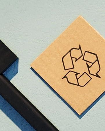
Sürdürülebilir ambalaj kullanarak yedek parça erişimini artırarak ve döngüsel iş çözümleri geliştirerek ekonomiye katkıda bulunuyoruz.
-

2030 İklim Hedeflerimiz
2030 yılına kadar karbon ayak izimizi yarıya indirerek daha sağlıklı evler için öncü çözümler yaratmayı hedefliyoruz.
-
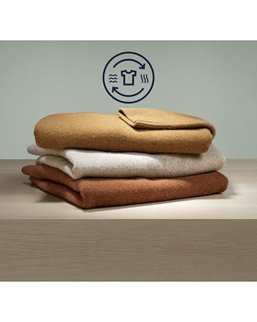
Sürdürülebilir Bakım
Yıkama verimliliğini artıran ve çamaşır bakımını sağlayan çözümlerle sürdürülebilir yıkama uygulamalarına katkıda bulunuyoruz.
-

Daha iyi Bir Yaşam İçin
Dünyanın her neresinde olursanız olun, Electrolux size daha iyi ve sürdürülebilir bir yaşam fırsatı sunuyor.
-
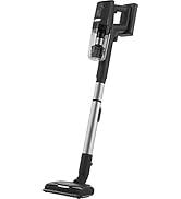
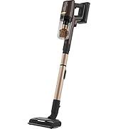
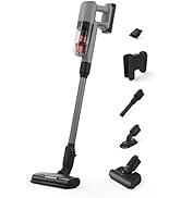
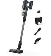
Şarjlı Süpürgeler
Neden idefix?

Siparişinizi teslim aldığınız tarihten itibaren 14 gün içinde iade edebilir, iade sürecinin tamamlanmasının ardındansa ödemenizi hızla geri alabilirsiniz.

Kullanıcı dostu ara yüzümüz tüm ihtiyaçlarınıza eksiksiz yanıt verebilmek için tasarlandı. Deneyiminizi uçtan uca kusursuz kılmak adına çağrı merkezimiz ve canlı destek hattımızla ihtiyaç duyduğunuz her anda yanınızdayız!

Siparişlerinizin bir an önce ulaşması için sabırsızlandığınızın farkındayız. Sunduğumuz farklı teslimat seçenekleri arasından size en uygununu belirlemeniz, siparişinizi olabildiğince çabuk veya dilediğiniz zaman aralığında sorunsuz bir biçimde teslim etmemiz için yeterli.