


-


Bestway, 30 yıldır yenilikçi eğlence ürünlerinin araştırılması, tasarımı ve geliştirilmesine odaklanmıştır.
Hava yatakları, kaplıcalar, yüzme havuzları, robotlar, eğlence ürünleri, spor malzemeleri ve kamp aksesuarları..
Bestway, en zorlu tüketicilerin beklentilerini karşılamak için her mevsim yeni ve kaliteli ürünler geliştirmeye adanmıştır.
-
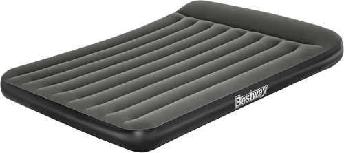
| Beden | Small |
| Önemli Özellik | Dahili Yastık |
| Marka | Bestway |
| Renk | Schwarz |
| Malzeme | Plastik |
Neden idefix?

Siparişinizi teslim aldığınız tarihten itibaren 14 gün içinde iade edebilir, iade sürecinin tamamlanmasının ardındansa ödemenizi hızla geri alabilirsiniz.

Kullanıcı dostu ara yüzümüz tüm ihtiyaçlarınıza eksiksiz yanıt verebilmek için tasarlandı. Deneyiminizi uçtan uca kusursuz kılmak adına çağrı merkezimiz ve canlı destek hattımızla ihtiyaç duyduğunuz her anda yanınızdayız!

Siparişlerinizin bir an önce ulaşması için sabırsızlandığınızın farkındayız. Sunduğumuz farklı teslimat seçenekleri arasından size en uygununu belirlemeniz, siparişinizi olabildiğince çabuk veya dilediğiniz zaman aralığında sorunsuz bir biçimde teslim etmemiz için yeterli.