






Soundform Mini Çocuk Kablosuz Kulaklık (Mavi) – Dahili Mikrofon, 30 Saat Çalma, Eğlenceli Çık

Belkin Soundform Mini Çocuk Kablosuz Kulaklık (Mavi) – Dahili Mikrofon, 30 Saat Çalma, Eğlenceli Çık

  • Ürün Açıklaması
  • Ürünün Özellikleri
  • İptal İade Koşulları
  • Soru ve Cevap (0)

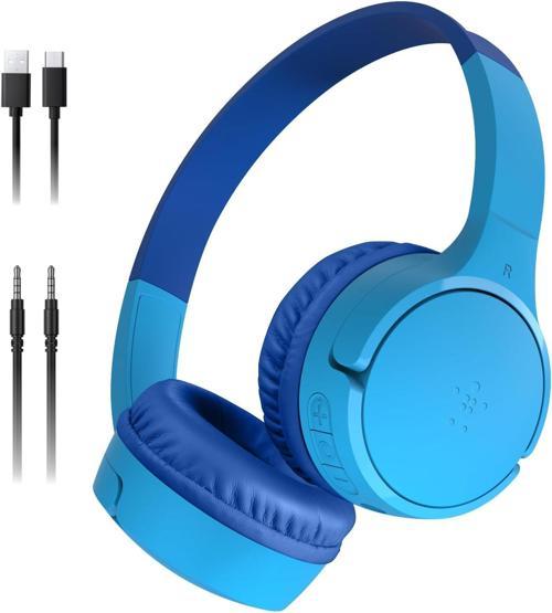
  • BLUETOOTH CONNECTIVITY: Easily connect to iPhone, iPad, Galaxy, and other devices with Bluetooth 5.3 pairing. Long-lasting battery allows kids to enjoy up to 30 hours of play when fully charged while maintaining their connection from up to 30 feet away.
  • USB-C FAST CHARGING: This wireless kid's headset has a built-in USB-C port for fast charging (USB-A to USB-C cable included). Just 10 minutes of charging can provide 3 hours of playtime, so kids can enjoy less time plugged in and more time jamming out!
  • BUILT-IN MICROPHONE & SAFE SOUND: Utilize a built-in microphone for video and phone calls. And with Belkin Signature Sound with audio tuned specifically for kids, this headphone set has an 85dB volume limiter to protect your little one's hearing.
  • COMFORTABLE DESIGN: SoundForm Mini is cleverly crafted for a wide range of boys and girls, with an over-the-ear design and comfortable, kid-sized cushions.
  • EASY TO USE CONTROLS: Touch controls on the headphones make it easy to play, pause, adjust volume, and pair with Bluetooth compatible devices. Plus, an optional 3.5mm aux port and included 4-foot cable allow for wired connection to your device.
  • Markadan
    .aplus-v2 .container-with-background-image { width: 100%; height: 100%; background-repeat: no-repeat; background-size: cover; } function logShoppableMetrics(moduleName, showsAddToCart) { if (window.ue && window.ue.count) { window.ue.count("aplus:shoppable:" + moduleName + ":addToCart", showsAddToCart ? 1 : 0); } }
    /* * Used when device = desktop * Configured in: configuration/brazil-config/global/brand-story.cfg */ /* Because the carousel is implemented as an ol list, any lists in the card text will have a secondary list style (letters). This will give an incorrect appearance to viewers, so we set all lists to the primary list style (numbers). */ .aplus-brand-story-card ol li { list-style: decimal; } /* Top level containers */ .aplus-module .apm-brand-story-hero { -moz-box-sizing: border-box; -webkit-box-sizing: border-box; box-sizing: border-box; width: 1464px; height: 625px; background-color: #fff; } .aplus-module .apm-brand-story-card { -moz-box-sizing: border-box; -webkit-box-sizing: border-box; box-sizing: border-box; width: 362px; height: 453px; background-color: #fff; } .apm-brand-story-hero, .apm-brand-story-card { -moz-box-sizing: border-box; -webkit-box-sizing: border-box; box-sizing: border-box; position: relative; width: 100%; height: 100%; float: none; } .aplus-module.brand-story-card-1-four-asin .apm-brand-story-card { /* Only 12px to account for image cell border */ padding: 12px; } /* Full background image (Hero 1 & Card 2) */ .aplus-module .apm-brand-story-background-image { -moz-box-sizing: border-box; -webkit-box-sizing: border-box; box-sizing: border-box; overflow: hidden; position: absolute; width: 100%; height: 100%; } .aplus-module .apm-brand-story-background-image img { display: block; width: 100%; height: 100%; object-fit: cover; } /* Card 1 small images */ .aplus-module .apm-brand-story-image-grid { -moz-box-sizing: border-box; -webkit-box-sizing: border-box; box-sizing: border-box; padding: 0px; margin: auto; display: flex; flex-flow: row wrap; } .aplus-module .apm-brand-story-image-grid .apm-brand-story-image-grid-item { /* Use content-box to ensure image size matches editor schema */ -moz-box-sizing: content-box; -webkit-box-sizing: content-box; box-sizing: content-box; padding: 0px; margin: 2px; width: 162px; height: 185px; border: 1px solid #fff; } .aplus-module .apm-brand-story-image-grid .apm-brand-story-image-grid-item .apm-brand-story-image-link { display: block; width: 100%; height: 100%; padding: 2px; } .aplus-module .apm-brand-story-image-grid .apm-brand-story-image-grid-item .apm-brand-story-image-link .apm-brand-story-image-img { display: block; width: 100%; height: 100%; object-fit: cover; } /* Card 3 logo image */ .aplus-module .apm-brand-story-logo-image { -moz-box-sizing: content-box; -webkit-box-sizing: content-box; box-sizing: content-box; height: 145px; margin: 0px 4px; padding: 20px; padding-bottom: 0px; } /* Text overlays */ .aplus-module .apm-brand-story-text-bottom { -moz-box-sizing: border-box; -webkit-box-sizing: border-box; box-sizing: border-box; position: absolute; bottom: 13px; left: 13px; } .aplus-module .apm-brand-story-hero .apm-brand-story-text-bottom { background-color: rgba(0,0,0,0.6); color: #fff; padding: 13px 65px 13px 13px; /* accounts for overlap of first card */ width: 437px; } .aplus-module.brand-story-card-2-media-asset .apm-brand-story-text-bottom { background-color: rgba(255,255,255,0.6); color: #000; padding: 13px; width: 336px; } .aplus-module.brand-story-card-1-four-asin .apm-brand-story-text { margin-top: 8px; padding-left: 2px; padding-right: 2px; } .aplus-module.brand-story-card-1-four-asin .apm-brand-story-text.apm-brand-story-text-single { margin-top: 20px; } .aplus-module.brand-story-card-1-four-asin .apm-brand-story-text h3 { white-space: nowrap; overflow: hidden; text-overflow: ellipsis; } .aplus-module .apm-brand-story-slogan-text { -moz-box-sizing: content-box; -webkit-box-sizing: content-box; box-sizing: content-box; margin: 0px 4px; padding: 20px; } .aplus-module .apm-brand-story-faq { -moz-box-sizing: content-box; -webkit-box-sizing: content-box; box-sizing: content-box; padding-top: 10px; } .aplus-module .apm-brand-story-faq-block { margin: 0px 10px; padding: 10px; } .aplus-v2 .apm-brand-story-carousel-container { position: relative; } .aplus-v2 .apm-brand-story-carousel-hero-container, .aplus-v2 .apm-brand-story-carousel-hero-container > div { position: absolute; width: 100%; } /* Ensuring the carousel takes only the space it needs. The sizes need to be set again on the absolutely positioned elements so they can take up space. */ .aplus-v2 .apm-brand-story-carousel-container, .aplus-v2 .apm-brand-story-carousel-hero-container { height: 625px; width: 100%; max-width: 1464px; margin-left: auto; margin-right: auto; overflow: hidden; } .aplus-v2 .apm-brand-story-carousel-hero-container, .aplus-v2 .apm-brand-story-carousel-hero-container > div { height: 625px; } .aplus-v2 .apm-brand-story-carousel.a-carousel-container { padding: 0px; } /* This centers the carousel vertically on top of the hero image container and after the logo area (125px). Margin-top = (heroHeight - cardHeight - logoAreaHeight) / 2 + logoAreaHeight */ .aplus-v2 .apm-brand-story-carousel .a-carousel-row-inner { margin-top: 149px; } /* Cards need to have a width set, otherwise they default to 50px or so. All cards must have the same width. The carousel will resize itself so all cards take the width of the largest card. The left margin is for leaving a space between each card. */ .aplus-v2 .apm-brand-story-carousel .a-carousel-card { width: 362px; margin-left: 30px !important; } /* styling the navigation buttons so they are taller, flush with the sides, and have a clean white background */ .aplus-v2 .apm-brand-story-carousel .a-carousel-col.a-carousel-left, .aplus-v2 .apm-brand-story-carousel .a-carousel-col.a-carousel-right { padding: 0px; } .aplus-v2 .apm-brand-story-carousel .a-carousel-col.a-carousel-left .a-button-image, .aplus-v2 .apm-brand-story-carousel .a-carousel-col.a-carousel-right .a-button-image { border: none; margin: 0px; } .aplus-v2 .apm-brand-story-carousel .a-carousel-col.a-carousel-left .a-button-image .a-button-inner, .aplus-v2 .apm-brand-story-carousel .a-carousel-col.a-carousel-right .a-button-image .a-button-inner { background: #fff; padding: 20px 6px; } .aplus-v2 .apm-brand-story-carousel .a-carousel-col.a-carousel-left .a-button-image .a-button-inner { border-radius: 0px 4px 4px 0px; } .aplus-v2 .apm-brand-story-carousel .a-carousel-col.a-carousel-right .a-button-image .a-button-inner { border-radius: 4px 0px 0px 4px; }