


-


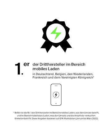
Belkin'de detay ve kullanım kolaylığı için göz ilk sıradadır. 40 yıldır pazar lideriyiz ve insanlara her günden daha fazlasını alma imkanı veriyoruz, çünkü güç kaynağı, bağlantı ve koruma için ürünler ve üretkenliği artırmak için ses ürünleri ve çözümler sunuyoruz. Küresel bir teknoloji şirketi olarak Belkin insanlar ve teknoloji arasındaki bağlantıdan ilham alır.
-
-
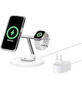
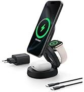
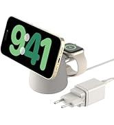
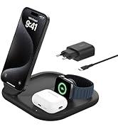
MagSafe ve Qi2 aksesuarları
-
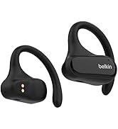
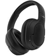
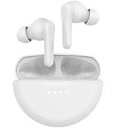
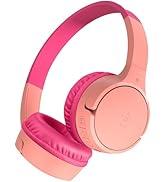
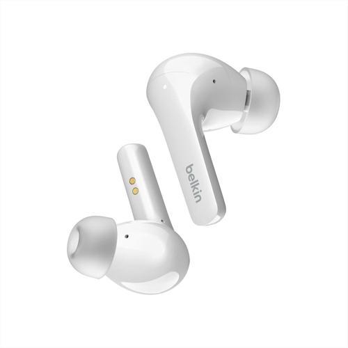
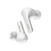
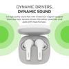
Hoparlör ve kulaklık
-

Neden idefix?

Siparişinizi teslim aldığınız tarihten itibaren 14 gün içinde iade edebilir, iade sürecinin tamamlanmasının ardındansa ödemenizi hızla geri alabilirsiniz.

Kullanıcı dostu ara yüzümüz tüm ihtiyaçlarınıza eksiksiz yanıt verebilmek için tasarlandı. Deneyiminizi uçtan uca kusursuz kılmak adına çağrı merkezimiz ve canlı destek hattımızla ihtiyaç duyduğunuz her anda yanınızdayız!

Siparişlerinizin bir an önce ulaşması için sabırsızlandığınızın farkındayız. Sunduğumuz farklı teslimat seçenekleri arasından size en uygununu belirlemeniz, siparişinizi olabildiğince çabuk veya dilediğiniz zaman aralığında sorunsuz bir biçimde teslim etmemiz için yeterli.